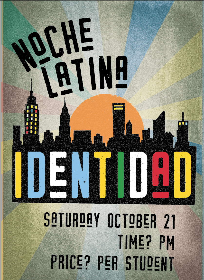
Still in progress. But they liked my design which means the hard part’s over. Oh my gosh I’m so relieved. This has been stressing me out for weeks.

My initial ideas were way different. I guess not way different conceptually. But way different stylistically for sure.
Ugg why do I write so light?
I had a hard time giving up the little banner feature. But I didn’t like how my drawing was looking 3D, and it felt too smooth to me. And then there’s the color issue. I’m such a girl. I was playing around with all these pretty colors and cursive fonts and totally dismissing any meaning.
I mean sheesh what kind of college student wants to go to a Latin cultural show that looks more like freaking Disney on Ice? It needed grit. Bad. Badly (adverb).

Ahh much better. The biggest lesson for me is color. I’m so quick to resort to making stuff pretty instead of giving it meaning. These colors actually represent the colors of Latin American flags. It’s so much better.
I like this whole blog thing. So far so good.


